Designing a logo is an in-depth, demanding process, and it’s worth keeping some key guidelines in mind when creating one to ensure the best possible results.
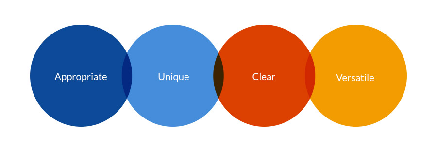
I believe there are 4 fundamental criteria that your logo should pass in order to be successful – your logo design should be Appropriate, Unique, Clear and Versatile.
Arguably there are other important attributes such as being memorable, which I think can be a good by-product of the logo design process, but don’t believe to be fundamental to its overall success.
I’ve also read other designers saying that a logo should be ‘timeless’ – and while that is possible (coca-cola for instance), I think it’s normal for rebranding to occur every 4/5 years or so to keep up with the latest design trends and culture.
1. Appropriate for your audience
The first and most important consideration for a logo design is making sure it is appropriate. The logo should not only reflect the values and personality of the business, but also those expected by your target audience.
For example, if you were creating a logo for a firm of solicitors or a corporate finance company, then it would make sense and be appropriate to use fonts, colours and a look and feel which are corporate in nature, and exude a certain seriousness.
Here’s a logo for example which we created for Acuity who are an international corporate finance advisory…

On the other hand, the same approach would not work for a kid’s nursery or an adventure sports brand, where the logo can potentially be much more playful in nature. Here’s a logo we created for an outdoor team building and country sports company…

2. Unique
As well as being appropriate, your logo design should stand out from your competition and the crowd, it should offer a different choice. Of course, it’s not enough to simply have a different design for the sake of it, this differentiation should be demonstrated by your entire brand.
Designing a logo which is entirely unique these days is sometimes quite an ask as so many ideas exist and have been explored already, but I find you can always add a twist to be more unique – whether it’s a font, a colour scheme or a different style of icon.
A good example of this is a logo we created for our client Mango HR. Traditionally other competitors are fairly safe in terms of brands, so Mango HR saw this as a good opportunity to create branding which reflected their fresh and youthful approach, hence we created a logo which was vibrant, colourful and contemporary…

3. Clear and simple
Clarity is important in logo designs too, how many times have we seen massively over-complicated logos which are hard to read, cluttered and unusable?
In general, I find that the more you can pare back a design to it’s raw basics, the stronger and more elegant that design will be. A clear and simple logo in turn, is much more likely to be memorable and versatile too (see below). Some good examples of clear and simple logos:

Examples of simple and clear logo designs
4. Versatile
So you’ve arrived at a logo concept that you are happy with, great. But have you thought about how that logo is going to be used in the future?
Some logo applications it’s always worth considering:
- On a website
- On a mobile phone / tablet
- As an icon for a mobile app
- On Social media (square format is great for social icons for example)
- Very large on a billboard or side of a bus
- Very small on the spine of a book, or a pen
- On business cards
- On the side of a van
- On various size web banners
- In an animation
…and have you thought about how it will look in single colour, in black, in white?
…does your logo give scope to be developed and used to create sub brands in the future if required?

